New Design :Pro Hospital VIS
It is composed of hearts according to whole model of the sign . Shown the distant view of the hospital and reflected the staff's values , make the staff and collective approve in the undertaking is pursued , invisible making staff's psychological spirit encouraged, keep the strong vitality of our collective, become our common hope: " live from here at the beginning healthily! " . Defined the staff's values at the same time .
從標志的整體造型來看是由心組成的.展示了醫院的遠景及體現了員工的價值觀,使員工與集體在事業追求上得到認同,無形的使員工心理精神得到激勵,保持著我們集體強大的生命力,成為我們共同的愿望:"健康生活從這里開始!".同時也明確了員工的價值觀。考慮醫院是一個以生殖為主,所以我們在顏色和形體的構思中,從“羞答答的玫瑰靜悄悄的開”展開。
這個項目從去年開始一直到今年4月結束。是我個人比較滿意的一個標識作品。
陜西生殖醫院視覺識別系統設計導入。 WWW.NATURE8.COM 2005.04 Design:Nature


封面。顏色大膽的嘗試了橙色,因為我們想斤客戶營造一種家的感覺。


相關文章:
推薦設計
優秀海報設計精選集(8)海報設計2022-09-23

充滿自然光線!32平米精致裝修設計2022-08-14

親愛的圖書館 | VERSE雜誌版版式設計2022-07-11

生活,就該這麼愛!2022天海報設計2022-06-02


最新文章

Faraway精品酒店品牌視覺設VI設計2023-12-12
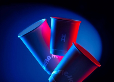
華夫餅屋(Waffle House)品VI設計2023-12-09

Talllk Café咖啡品牌設計VI設計2023-11-29
SOF Hotel酒店品牌VI設計VI設計2023-11-29