字體設計基礎(1)視覺均衡

100% practical. Sketches have been made to explain some basic issues in type design during the workshops. They get used to point out some problems which raise while creating a new typeface. Only some foundations are shown, no deep sophisticated details.
(寫在前面)
100%實用。這一系列關于字體設計的討論文章來自typeworkshop.com,每篇文章都配有手繪的插圖,以闡明字體設計的一些基本事項,指出設計新字體時可能會遇到的一些問題。這里只講述一些最基礎的東西,未涉及復雜的技術細節。
Same size for all! To optically align all characters on a line, they cannot not have exactly the same mathematical height. For example the triangle on this drawing has to be higher than the rectangle. If this is not the case, the triangle will for sure look smaller than the rectangle. While creating a typeface, you want all the letters to have the same height.
為了讓所有字符在視覺上對齊,它們就不能采用同樣的物理尺寸。比如說,下圖中的三角形的高度就必須大于矩形。否則,三角形看起來就要比矩形小很多。 而我們在設計字體的時候,往往想給它們定義同樣的高度。
Also round forms have to exceed the baseline to be optically the same. If the circle would have exactly the same mathematical height as the rectangle, it would look smaller than the square. This doesn't only count for basic forms like triangles, circles and squares. It's essential in type design, because they apply to every single character in a typeface. Then it even doesn't matter if you're designing a latin, cyrillic or greek font. It's a basic principle for any kind of shape.
同樣的 ,為了使圓形看起來和矩形同樣大小,圓形就必須超出基線。如果圓形和矩形物理尺寸一樣,圓形看上去就會比矩形小。這一規則不僅僅適用于三角形、圓形、方形這樣的基本形狀,這是字體設計的基本原則,整個字體中的所有字符都適用這一原則。不管你設計的是拉丁字體、還是斯拉夫或者希臘文字體,這是所有形體都必須遵循的基本準則。
(2)術語
Type terminology. Communication during the design process is much easier when using basic terminology of type. Here are a couple important ones, which will help to bring the conversation a bit further than 'yeah, that there, that little black thing.' The counter of the 'e' can also be called an 'eye', but there are many more terms. If you want to know them all, go to the library or browse-the-web.
使用字體的基本術語,會讓設計過程中的交流變得非常容易。這里是一些基本的術語,讓你的交流能夠更深入,而不是“嗯,那里,那個,那個黑色的小玩意……”小寫e的"字懷"(“字谷”)有時候也被稱為是字“眼”,如果你還想更全面的了解其他術語,可以去圖書館,或者是參考下面的網絡資源。(譯注:很遺憾,原文中鏈接的一些資源已經無法訪問了。但我們可以用google找到其他的資源。這些術語很重要,如果你希望閱讀西方的第一手的字體設計研究資料,這是必須跨越的一關。但目前在國內的設計界似乎還沒有一個統一的翻譯,不少書籍的翻譯都是各行其是,讓讀者也無所適從。有時間我會找一篇比較完整的來翻譯。)
http://www.adobe.com/type/topics/glossary.html
http://gmunch.home.pipeline.com/typo-L/faq/anat.htm
http://www.google.cn/search?client=aff-cs-maxthon&ie=UTF-8&oe=UTF-8&hl=zh-CN&q=typography%20anatomy&um=1&sa=N&tab=iw
(3)流線型
Fluent shapes. Designing type is like driving a car. If you drive a car, you always take the curve in a natural way. If you draw a curve (of a character) on paper, this is exactly the same. The curve starts smoothly, never out of a sudden. While driving a car, you don't start turning the wheel when you are already in the beginning of the curve. A while before you arrive in the curve you anticipate by leading your car gently in the right direction. Think about driving a car when you are sketching type on a paper.
流線型。設計字體就象開車。你在開車的時候,總是會以自然的曲線過彎。當你在紙面上繪制一條曲線(或是字符)的時候,也是同樣的道理。曲線平滑的開始,而不是陡然出現。開車時,你不會在已經到達了彎道口之后才開始打方向盤,而是在你預計即將進入彎道的時候,就開始慢慢的將你的車引入正確的方向。當你在紙上畫草圖的時候,多想想你是怎樣開車的。
(下面有圖片。)

圖片上的文字:
標題:動態的曲線
左:怎樣才能最快的駛過這條彎道?
右1:幾何曲線
右2:自然曲線
右下:平滑的開始轉向,更自然,更快速!
(4)書法原型

點擊放大
Calligraphic origin. The characters on the top line have a different construction than the characters on the bottom line. They have a different calligraphic origin. It doesn't matter if a typeface has serifs (like Times New Roman) or not (like Arial). It's about the original way they where constructed.
圖中上下兩行字母有著不同的結構,它們來源于不同的書法原型。不管這種字體是襯線字體(如Times New Roman)還是無襯線字體(如Arial),它們的架構都源于它們的書法原型。
The characters in the top line are constructed with a pointed pen (calligraphic tool). The contrast is caused by changing the pressure on the pen, not because of the form of the pen. Bodoni is one example of this, but also sans serif faces like Helvetica have this origin. The thickest part will be (mostly) totally vertical. From this perspective there is no difference between Bodoni and Helvetica. They both have the same construction. Only the contrast varies.
上面一行的字體的書法原型是一種尖頭的書法鋼筆。其筆畫的粗細對比是通過改變筆壓來實現的,而與筆尖本身的形狀無關。Bodoni字體就是一個例子,但是象Helvetica這樣的無襯線體也是來源于此。筆畫最粗的部分幾乎都是垂直的。從這個角度來看, Bodoni和Helvetica是同出一轍的。它們的架構是一致的,只是筆畫的粗細對比有區別。
The characters in the bottom line have a origin which is derived from the broad nip. The calligraphic pen itself has a thick and a thin part. The contrast in the type is made because of the form of the pen, not because of the pressure. You slant the pen with an angle of 30 degrees on the paper. In that way your thickest part of a character will not be on a vertical direction, but will be on an angle. Also the thinnest part will not be on the most horizontal parts. Typefaces like Garamond and Minion have this kind of construction. But also sans serif faces like Gill Sans have a construction which is originally derived from the broad nip.
下面一行字體來源于一種筆尖扁平的鋼筆。這種書法鋼筆正面寬而側面窄。字體的筆畫粗細是由于鋼筆本身形狀的差異造成的,而不是筆壓。你書寫的時候筆身是傾斜的,和紙張形成30度的傾角。因此筆畫最粗的部分就不是垂直方向的,而是有一定角度的傾斜。同樣的,筆畫最細的部分也不是位于水平方向上。Garamond 和 Minion 字體就是這種結構。但象Gill Sans 這樣的無襯線字體也同樣是起源于這種筆尖扁平的鋼筆。
推薦設計
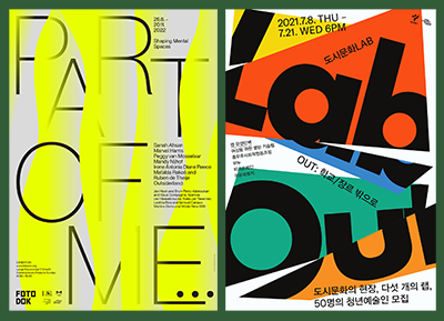
優秀海報設計精選集(8)海報設計2022-09-23
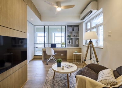
充滿自然光線!32平米精致裝修設計2022-08-14
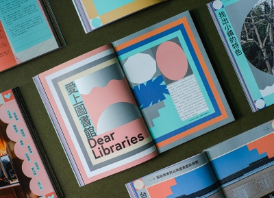
親愛的圖書館 | VERSE雜誌版版式設計2022-07-11

生活,就該這麼愛!2022天海報設計2022-06-02


最新文章
圖片排版的17個實用技巧設計理論2019-06-21

2019-2020設計趨勢:Avatar角設計理論2019-06-13

2019-2020設計趨勢·IP形象篇設計理論2019-05-28
排版三要素:字號、行距設計理論2019-05-24