(17)形態的平衡
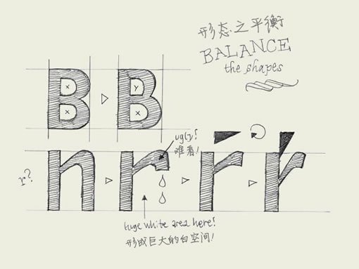
Balance shapes. If you make both of the inner forms (counters) of the 'B' exactly the same, the top counter will optically look bigger. Your character will look plumby, like it's falling down. If you make the top counter smaller than the bottom one, your character looks much more balanced.
如果你把字母“B”上下兩個內部形狀(字懷)弄得完全一樣,上面的字懷在視覺上就會更大。你的字母看上去就好像站立不穩,搖搖欲墜。如果你把上面的字懷弄得小一些,整個字符看起來會更平衡。
The counter of the 'B' doesn't have to be exactly the same as the counter of the 'P' for example. If you would make them exactly the same, the right sidebearing of the P would be much too big. So you have to balance the black and white spaces in every character separately. However, there must be a relationship between the amount of white space inside a 'B' and inside a 'P'.
同樣的,字母“B”字母“P”的字懷也不需要完全一樣。如果兩者完全一樣,“P”的右部空間就顯得太大了。所以對每個字符的黑白空間你都要進行單獨的平衡。但是,“B”和“P”兩者內部白空間的大小一定存在著某種關聯。
About making a lowercase 'r': it's not an 'n' with an amputated leg. Your 'r' can get very weak and soft in that way. You can make it much stronger if you let the ending of the 'r' follow the horizontal reading direction. In that way, the space on the right side of the 'r' will be more open, and more balanced. It will not disturb the rhythm of your type because the right sidebearing can be much smaller. The whole letter can be made more narrow as well. As a consequence the white space in the top of the 'r' could be has to be changed. In case you change that form, optically you'll not confuse the 'r' so quickly with the 'n' as well.
說到怎樣做一個小寫的“r”:它絕對不是一個把一邊腿鋸斷的“n”。如果那樣做,你的“r”會被弄得非常的虛弱。如果你讓“r”的末筆順著水平的閱讀方向,就可以讓它看上去更健壯。同時“r”的右部空間會更開放,更平衡。這不會有損于字體的節奏,因為“r”右部的安全空間可以設置得非常小。整個字母可以做的更窄。這樣一來,“r”頂部的白空間就不得不改變。形狀改變之后還有一個好處,你就不會在匆匆一瞥之下把“r”錯看成“n”。
譯注:
sidebearing 字符前后預留的安全空間(或者叫緩沖區),以避免前后字符筆畫發生碰撞。分為左部空間和右部空間。
參考鏈接:http://www.myfirstfont.com/glossary.html
(18)字距調整
Kerning. Knowledge about kerning will give a deeper understanding of type. However, forget about kerning for now, spend your time on other things. It's much more important to properly space your characters.
字距調整的知識會讓你對字體的理解更進一步。但我們現在先暫時把它忘記,先花點時間看看另外的東西。如果你想正確的設置字符間距,這個要重要得多。
A kerning pair is a technical issue for optical reasons. Simply said: when one certain character is followed by another character you can define a different space in between these two characters. This space can vary from the the normal spacing (right sidebearing of the first character + left sidebearing of the second character). The difference can be positive or negative; you can add more space for a certain combination or you can reduce the space. A kerning pair can technically be implemented in a digital font file.
字距配對(kerning pair)是一種因視覺需要而做的技術處理。簡單說,在兩個特定的字符連排的時候,你可以為它們單獨指定與眾不同的字符間距。這個間距可以不同于標準間距(前一個字符的右部安全空間+后一個字符的左部安全空間)。這個間距可以是正的也可以是負的,你可以為某個字符對設置更多或更少的空間。數字化的字庫文件中可以實現這種字距配對。
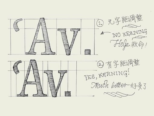
In some cases kerning is inevitable and necessary. When a capital 'A' is followed by a lowercase 'v', a big white space will appear which cannot be solved by adapting the spacing of the characters. Changing the spacing would mess it up when they would be combined with other characters again. For this occasion a kerning pair is needed (see drawing). In the sketch you only see some examples where the kerning pair is negative; reducing space. But you can also imagine a positive kerning pair when a 'f' is followed by a bracket for example; "f)". More space has to be added to avoid those characters overlapping eachother.
有些場合這種字距調整是必不可少的。當一個大寫A后面跟隨一個小寫v的時候,兩個字符間就會出現巨大的白空間,這是普通的字符間距所無法解決的。如果改變它們的間距,它們和其他字母連排的時候就會擠成一團。這時候就需要字距配對來處理了(如圖)。圖中只出現了字距配對為負的例子――縮減空間。但你可以想象一個字距配對為正的例子:一個小寫f后跟隨一個括號,例如:“f)”。這時候就需要加入更多的間距以避免兩個字符重疊在一起。
(19)連字
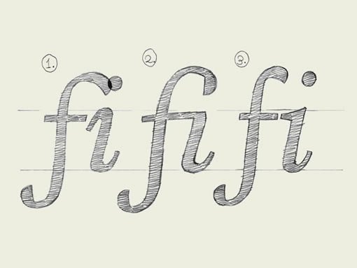
Ligatures. In a very few cases they are essential. Some well known ligatures are 'fi' and 'fl'. The inevitable need for a ligature is depending on the design of a font. Not every typeface will need a ligature for a 'fi' combination. But in some cases the dot of the 'i' is interfering with the 'f'. Get rid of all that annoying row but making a ligature, one glyph which represents two (or more) characters. Next to a functional aspect, there is an aesthetic aspect of ligatures. You could create a ligature for a 'st' combination, or maybe for 'nky' or 'ism'. Anything is possible. Admitting that also this is not the most urgent issue in type design, it's another obstacle on the road to perfection!
只有極少數的場合才需要用到連字。比較常見的連字有“fi”和“fl”。連字是否必不可少,取決于字體的設計。不是每種字體都需要"fi"的連字組合。但有些時候字母“i”上面的圓點會和前面的“f”相撞。一勞永逸的解決方案是做一個連字,用一個字符代替兩個(或更多的)字符。連字的出現的原因,除去功能上的需要,還有審美意義上的。你可以做一個“st”的連字組合,或是一個“nky”或“ism”。任何字符都是有可能的。這個章節同樣也不是學習字體設計最迫切需要的知識,但這是通向完美之路上另一道必須逾越的障礙。
(譯注:到今天為止,整個《字體設計基礎》系列文章就全部翻譯完了。了卻一樁心事。感謝大家一直以來的支持。)
推薦設計

優秀海報設計精選集(8)海報設計2022-09-23

充滿自然光線!32平米精致裝修設計2022-08-14

親愛的圖書館 | VERSE雜誌版版式設計2022-07-11

生活,就該這麼愛!2022天海報設計2022-06-02
最新文章

圖片排版的17個實用技巧設計理論2019-06-21

2019-2020設計趨勢:Avatar角設計理論2019-06-13

2019-2020設計趨勢·IP形象篇設計理論2019-05-28

排版三要素:字號、行距設計理論2019-05-24
