(13)x高度

圖中文字:
上右:正文字體擁有一致的視覺高度。(而物理尺寸是不一樣的)
下右:特排字體的x高度更偏向于物理尺寸上的一致。
x-heights. If you make a light weight and the black weight of one typeface, you'll have to make sure that the black weight has a bigger x-height than the light weight (top line drawing). If this is not the case, the black weight will look optically too small when it's combined with the light weight in a line of text.
如果你制作一個包含輕磅(細線體)和重磅(粗黑體)的字體,你應該確保粗黑體的x高度應當比細線體的略大(見圖中上一行)。否則,當粗黑體和細線體在同一行中連排時,粗黑體看上去就要比細線體要小得多。
In display sizes this is not exactly the same. If the type is printed in big sizes there can be a much smaller difference between the x-height of the light and the black weight (bottom line drawing).
但在特排使用中,情況就不太一樣。當字體大字號印刷時,兩者的x高度之間的差異就微乎其微了(參見圖中下一行)。
(14)粗體

Bold-faced. Since the introduction of the computer, type design has become available to a wide audience like never shown before in history. Of course the digitalization makes many acts easier and particularly faster. This doesn't mean it automatically gets better, but that's another story. For example, many font software programs have included an option to 'bolden up' your regular weight. The outlines of the perfectly designed font get expanded, but the program is trying to fool you. That's not a bold. It's a limousine which got quickly extended by a local blacksmith. The contrast will probably be destroyed (see the second 'a' in the drawing). Doing this by hand will give a much more pleasurable result. No matter how well font software programs will improve in the future, there is only one thing that really counts in the end: your critical eye.
計算機的普及,使得廣大的用戶得以接觸到字體設計,這在以前是從未有過的。數字化讓許多操作變得更簡單和快捷,但不意味著它會自動的獲得更好的結果,那完全是兩碼事。舉個例子,許多字體軟件都包含一個字體“加粗”選項,能將原先完美設計的字體輪廓加以擴展。但實際上軟件只是在欺騙你。那并非真正的粗體,那只是一輛由村里的鐵匠臨時改長的“加長型”豪華轎車。筆畫的粗細比率可能全被破壞了(見圖例中第二個a)。手工操作的結果會更令人滿意。不管將來的軟件如何進步,最終起決定作用的東西只有一個:你銳利的眼光。
(15)線稿的數字化

圖片上的文字:
右:為初學者熱身
下1:將控制點限制在水平或者垂直方向上
下2:只在必要的地方使用節點(能用一個點完成的,就不要用兩個點)
Digitizing sketches. When the handmade sketches on paper are ready to be scanned, take care of digitizing them in a proper way. More specifically, take care while converting your scanned image manually with a Bezier based pen tool. Too many points on a character, or points at the wrong position can have a negative influence at your font.
線稿的數字化。在紙上畫好線稿之后就可以掃描了,這時候要開始要注意,要用正確的方法將其數字化。說的更明確一點,在你用貝賽線鋼筆工具手工描摹你的線稿的時候,要留神。一個字符如果有太多的節點,或者是節點放置在不正確的位置上,都會給你的字體帶來負面的影響。
Too many points (=nodes) can not only cause technical problems -e.g. the printer can't print the font anymore- but it is also much harder to control the shapes of a character. Controlling a curve between two nodes is much easier than changing a curve with twelve nodes. Of course it's possible, but it will not end up in a fluent form.
過多的節點不僅僅會導致技術上的麻煩,例如打印機無法打印輸出,還會使得字符的外形更加難于控制。在兩個節點之間控制一條曲線,要遠遠容易過操縱一條有12個節點的曲線。當然這并非不可以,但多余的節點必然會導致外形的不平滑。
Having the nodes at the wrong position can cause technical problems -e.g. it's impossible to hint the font perfectly- but also practically it is recommendable to put nodes at extreme positions at your glyph. For example, digitizing an 'o' would only need 8 nodes. Four at the outer form, four at the counter form. Putting nodes at extreme positions (most top & down, most left & right) means the BCP (Bezier Control Point) will always be totally horizontal or vertical. In that case they are much easier to control. In most software programs you can use shift key to keep the BCP totally horizontal or vertical.
節點放置在錯誤的地方也會導致技術問題,例如無法實現字符在屏幕小字號下的完美顯示(hinting-在計算機屏幕上顯示小字號時的優化顯示技術,是設計者嵌入字體內部的提示信息)。建議是,把節點放置在字符的"頂點"位置。舉例說明,用貝賽線繪制一個“O”要用到8個節點。外面4個,內部的字懷4個。將節點放置在頂點(最上點、最下點、最左點和最右點),意味著BCP(貝賽線控制點)將全部是水平或者垂直的。這樣它們就非常易于控制。在大多數的軟件中,你可以用shift鍵來將BCP(貝賽線控制點)的移動限制在水平或垂直方向上。
(16)復制粘貼?

Copy-paste? When you have created a few basic characters, you also want to create the rest of the alphabet. But how? Copy and paste? Euhm, not really. Although, this can help you on the way.
當你設計了幾個基本的字符,你還想繼續完成整個字母表。該怎樣做?復制粘貼?嗯,不完全對,但,也會有助于你的開始。
There are some things which you can do, and some which you cannot do while copy-pasting. Some forms can be just the same. The ascender of the 'l' and 'h' for example. But maybe the bowl of the 'd' and 'q' as well. Once you created a 'd', this could work fine as a starting point for a 'b' and a 'p', by rotating the 'd' 180 degrees.
有些東西是復制粘貼可以完成的,有些則不是。有些形狀是完全一樣的。比如“l”和“h”的上伸部。“d”和“q”的字碗也有可能是一樣的。當你完成了一個“d”,你就可以把這個“d”旋轉180度,以此為基礎完成“b”和“p”的制作。
Copy-paste should not change the contrast in your typeface. When you make a typeface based on the broad nip, horizontal and vertical flipping will disturb the angle of your contrast, and will destroy your shape. However, by rotating a (part of a) character 180 degrees, the contrast remains perfect and untouched.
復制粘貼不會改變你字體的粗細比率。但如果你設計的是基于平頭鋼筆書法原型的字體(參見第四節-書法原型),那么水平或垂直鏡像的造字方法,就會影響字體粗細對比所形成的角度(譯注:對于這個角度,有一個更準確的術語:stress,應力),從而破壞字體的形狀。不過,通過把一個字符(或其部件)旋轉180度的方法來造字,則不會有損于粗細比率的完美。
But copy-paste doesn't bring you all the way there. It can work as a starting point, but manual adjustments will be mostly necessary. For example, if you have a 'n', you can quite quickly make a 'm' and a 'h', but also a 'u' (see drawing). Copy, paste and rotate the 'n'. Then cut some serifs, and... not ready yet! If you cut away the serifs, also on the inner side of the 'u', the white space inside the 'u' will get bigger then the white space inside the 'n'. This has to be optically corrected.
復制粘貼大法并不是萬能的,它只能作為一個起始點,大部分的時候都需要手工的調校。比如說,你已經有了一個“n”,你不但可以用來快速生成一個“m”和“h”,還可以用它來制作一個“u”(如圖)。復制,粘貼,然后旋轉這個“n”。切除不要的襯線,然后就…等等,還沒完!當你切除了內部的襯線之后,內部的白空間就會比“n”的要大,所以必須進行視覺上的微調。
One solution for this could be to make the 'u' a bit more narrow, or maybe another solution could be to make the serif on the top a bit longer (which also makes the innerform smaller of course). Whatever way you do it, make sure the inner forms have (optically) the same amount of white space. Only in that way you'll get a harmonious rhythm in your type.
一個解決方法是把“u”稍微擠壓一點,或者還有另外一個方法,加大內部右上角的襯線,這樣也能把內部的白空間減少一些。不管哪種方法,都必須確保字體的內部形狀在視覺上擁有同等的白空間。只有這樣,你的字體才能夠獲得和諧的節奏。
推薦設計
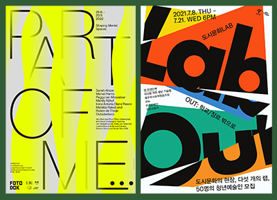
優秀海報設計精選集(8)海報設計2022-09-23
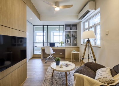
充滿自然光線!32平米精致裝修設計2022-08-14
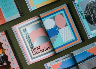
親愛的圖書館 | VERSE雜誌版版式設計2022-07-11

生活,就該這麼愛!2022天海報設計2022-06-02


最新文章
圖片排版的17個實用技巧設計理論2019-06-21

2019-2020設計趨勢:Avatar角設計理論2019-06-13

2019-2020設計趨勢·IP形象篇設計理論2019-05-28
排版三要素:字號、行距設計理論2019-05-24