(9)可讀性

Readability. The only important aspect of a text typeface is the readability. Many decisions can influence the readability. Which contrast you create, the length of the ascenders and descenders, the rhythm, the blackness of a type, the strength of the curves and the bowls, etc.
可讀性是正文字體的唯一考量指標。你對字體所做的許多決定都會影響可讀性。例如采用怎樣的粗細對比,上伸部和下伸部的長度,字體的節奏,黑度,曲線和字碗的力度,等等。
Most of those decision apply to all the characters inside a font. These have to be defined first. For example the contrast. The characters on the top line (see drawing) have a much bigger contrast than the characters on the bottom line. The type on the top line will be more suitable for display use, the type the bottom the bottom line more for text use. Not only because of the difference in contrast, but also because the characters on the top line are much more condensed. This makes them less legible in small sizes, but more eye-catching and flexible for headlines. Defining the contrast and the width are decisions which count for every single character in a font.
大部分的決定會影響到字體中的全部字符。下面這些是應該首先考慮的。比如說粗細對比。圖例中上面一行的字符筆畫粗細對比明顯要比下面一行的要大得多。上一行的字體更適合做特排字體,而下一行更適合做正文字體。不僅僅是因為它們粗細對比的差異,還由于上一行的字符的字寬更小,因而在小尺寸下更難以識別――但是卻更能吸引眼球,在制作標題的時候也更具靈活性。所以在定義字體的粗細對比和寬度的時候,要考慮到字體中的全部字符。
But also while designing every single glyph, you can create details which improve the readability of a font. For example, the ear of a 'g' can make sure the reader's eye will follow the horizontal reading direction more fluently. The 'g' on the bottom line will work much better in a text typeface for small sizes (see drawing).
不過,在設計每一個具體字符的時候,你可以通過增加一些細節來提升該字體的可讀性。舉例來說,小寫字母g右上角的字耳會有助于閱讀者的視線更平滑的水平移動。如果用作正文字體,圖中下面一行中的"g"在小尺寸下的表現會相當不錯。
(10)比例

Proportions. Which x-height to define? Which descender depth? Defining these proportions are essential, and very strongly connected to the purpose of the type. The proportions within a certain typeface are influencing the way your type will work & look. For example, it's impossible to create a space saving newspaper typeface with an extremely wide body width.
x高度應該定多高?下伸部應該多長?確定這些比例至關重要,并且與字體的用途緊密相關。字體的比例將影響其外觀及應用。比如說,如果你想設計一種節約版面的字體,那就不能給它設置極大的字寬。
Extremely short descenders will give a strange look to a text typeface. Even worse, they might not be visible at all anymore. But extremely short descenders can also be a smart decision, while creating a display or headline type. For a text typeface the ascender height should be as big or, even better, bigger than then cap height to give a optical pleasurable result (see drawing).
如果下伸部很短,字體看上去會很怪。或者更糟,閱讀者可能根本無法發現它。但很短的下伸部也可能是一個聰明的決定,當它用于特排字體或者標題字體的時候。 對一個正文字體來說,上伸部最好是和大寫高度一樣(或者更高一些更棒),以獲得良好的視覺效果。如圖。
(11)小型大寫

Small caps. You could guess it already from the name, small caps are small capitals. Capitals which have the same height as lowercase characters.
你可能看名字就猜出來了,小型大寫就是小號的大寫字母。和小寫字母一樣高度的大寫字母。
Why are small caps needed? Because of several typographical reasons. First of all a whole word set in caps will look awful, it will drown out the rest of the text. Second, in lots of typefaces the capitals are not designed and spaced to work together, but to be followed by a lowercase character. Small caps however are designed to purely work together. They will give a more pleasurable, harmonized result.
為什么會需要小型大寫?基于幾個排印上的原因。首先,全部設置大寫的單詞看起來一塌糊涂,會讓所有文本湮沒其中,難以辨識。其次,大部分字體中的大寫,根本就不是為大寫連排而設計的,它們的大寫字母間距是為后面跟隨小寫字母而設計的。小型大寫才是專為大寫連排而設計的。它們會得到更舒服和諧的效果。
Having said that small capitals are capitals on x-height, it's mostly not 100% true. To optically give them the same height, the small caps will have to be slightly bigger than lowercase characters of the same font (see drawing).
前面說小型大寫是和小寫字母一樣x-高度的大寫字母,其實是不太準確的。要得到和小寫字母同樣的視覺高度,同字體的小型大寫就必須比小寫字母稍微的更大一些。
(12)花式大寫?

Swash caps? Admitting that it's not the most urgent issue to learn in typography, it's interesting to quickly pay attention to this topic. Not every font family has a Swash variant. Most common are swash capitals, but also swash lowercase characters and swash-beginnings and -endings exist.
我承認,這不是學習字體設計最迫切需要了解的一節,但是這個話題很有趣,我們稍稍關注一下就好了。不是所有的字體家族都包含有花式的變體。最常見的一般是花式大寫,但同樣也有花式的小寫以及花式的首字和尾字。
Sometimes you want to set a whole line in capitals. It's possible to do this with roman capitals, although sometimes it's better to choose small capitals which are designed for this purpose. Roman capitals are not, but mostly they don't cause problems. Swash capitals however do. Swash capitals are mostly designed to give some extra visual pleasure to your designs. The caps are meant to be followed by lowercase characters (number 1), or used as an initial (number 2), but not to be combined with eachother. Only with some fonts it's possible to combine swash capitals with normal roman caps (number 3).
有時候你想要設置整行的大寫。可以用大寫正體來完成這一任務,雖然小型大寫可能是更好的選擇――那才是為此而設計的。大寫正體不是為了大寫連排而設計的,但多數情況下它們也不會造成麻煩。而花式大寫就不一樣。花式大寫的設計目的通常是用來為設計增添一些額外的視覺愉悅。其大寫是為后面跟隨小寫字母而設計的(圖1),或是用于首字下沉排版(圖2),但絕非用于大寫連排。只有某些特定的字體才有可能出現花式大寫與普通正體大寫的連排(圖3)。
推薦設計
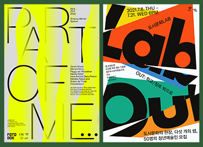
優秀海報設計精選集(8)海報設計2022-09-23
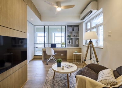
充滿自然光線!32平米精致裝修設計2022-08-14
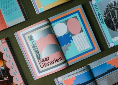
親愛的圖書館 | VERSE雜誌版版式設計2022-07-11

生活,就該這麼愛!2022天海報設計2022-06-02


最新文章

圖片排版的17個實用技巧設計理論2019-06-21

2019-2020設計趨勢:Avatar角設計理論2019-06-13

2019-2020設計趨勢·IP形象篇設計理論2019-05-28
排版三要素:字號、行距設計理論2019-05-24